

If you're in the travel industry and looking to breathe new life into your website’s call to action (CTA) buttons, you've landed on the perfect runway for inspiration!
In this blog post, we'll take a look at how some major players in the travel industry infuse creativity into their CTAs to drive more bookings. From unique copy to innovative design, there’s no shortage of ways to spice up your CTAs to improve website conversions.
As the travel and tourism industry bounces back to pre-COVID-19 levels, there’s no better time to experiment with your website experience. So pack your bags, grab your passport, and set your “OOO” auto-reply—we’re going on a journey through some of the best travel brand CTAs in use today.
Keep reading to check out CTA examples from Airbnb, BigBus, Booking.com, Club Med, and Royal Caribbean.
Airbnb: Icon CTA
CTA: 🔎
Who said a CTA even needs copy? Certainly not, short-term and long-term stay marketplace, Airbnb! On the right side of the search bar that appears at the top of Airbnb’s homepage, the brand entices visitors to search for a vacation rental with a small circular CTA, featuring a magnifying glass icon.
This simple design not only echoes Airbnb’s branding but also may appeal to its largely millennial user base, who is likely familiar with this type of imagery.

BigBus: Bright CTA on a Dark Background
CTA: Buy Tickets
Looking to grab visitors' attention and encourage them to buy tickets or secure a booking with your brand? Give tour company, BigBus’ CTA strategy a test drive! In the example below, the brand places a bright yellow CTA button against a dark maroon background to entice site visitors to buy tour tickets.

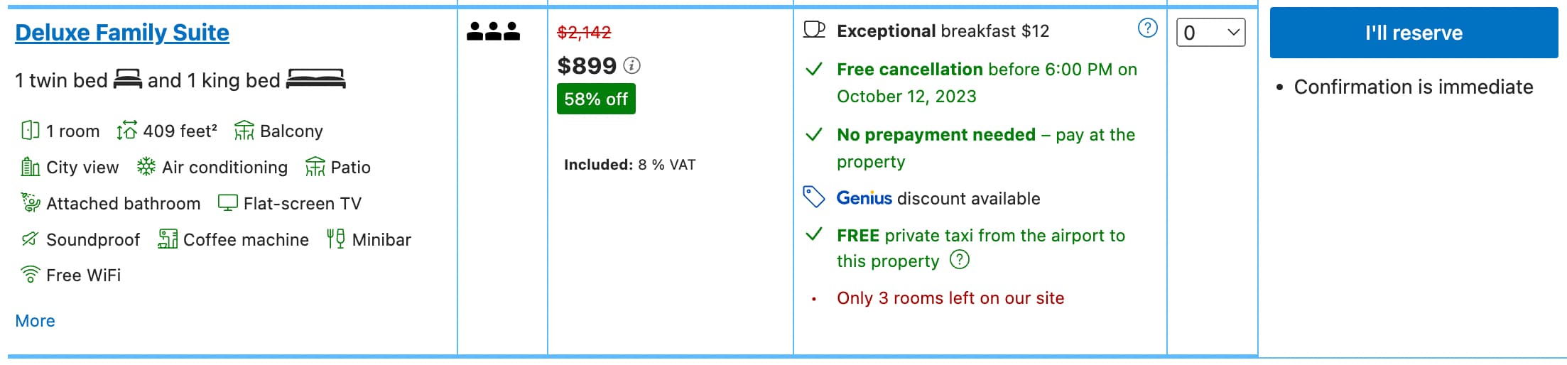
Booking.com: First-person CTA
CTA: I’ll Reserve
Although there are plenty of brands that swear by using the second-person point of view across their website copy, Booking.com has a different approach. Instead, the online travel agency uses the first-person point of view in the CTA on the right side of each of their product comparison matrices. In doing so, Booking.com, makes visitors feel like an active participant in their trip-planning process.
Club Med: Aspirational CTA
CTA: Plan your vacation
Club Med, known for its relaxing, all-inclusive resorts, uses one of its website CTAs to communicate to visitors that they’ll be booking a vacation—not just a hotel. By using the word “vacation” directly in the CTA copy, Club Med suggests to visitors that once they’re done booking through the site a full vacation awaits—no more planning necessary.

Royal Caribbean: CTA Leading to Longer Booking Flow
CTA: Explore this itinerary
As visitors consider dropping a pretty penny on a much-needed vacation, many will want a healthy amount of information about what they can expect from their trip. In the screenshot below, cruise company Royal Caribbean presents visitors with a bright blue “Explore this itinerary” button—even more noticeable than the “Select date” CTAs below it.
When a visitor clicks the blue CTA button, they are met with a longer booking flow that includes more trip details, beautiful photos, and ship amenities—a website experience that speaks to those who may not yet be ready to book. Those who click “Select date” are immediately sent to the first stage of the checkout process—perfect for decisive site visitors who are ready to get away!

We hope these five travel brand CTA examples give you the inspiration you need to start running new experiments on your travel website.


.jpg)